Dentally
Collaborating with Organic Agency to translate UX insights and wireframes into fully detailed high-fidelity website screens.
Client
Organic Agency
Project length
2 Weeks
Deliverables
Initial concepts
Final designs
Style guide DS
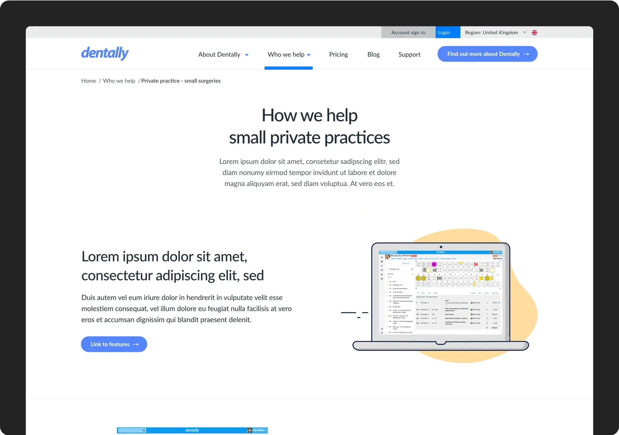
Navigation components
Tools
Figma
Miro
Summary
Working with Organic, the goal was to develop the UX/UI and wireframes from static Low-Fi concepts into final designs. This would address issues that Organic had identified in the customer journey, content, user needs and system structure for maintenance.
My role
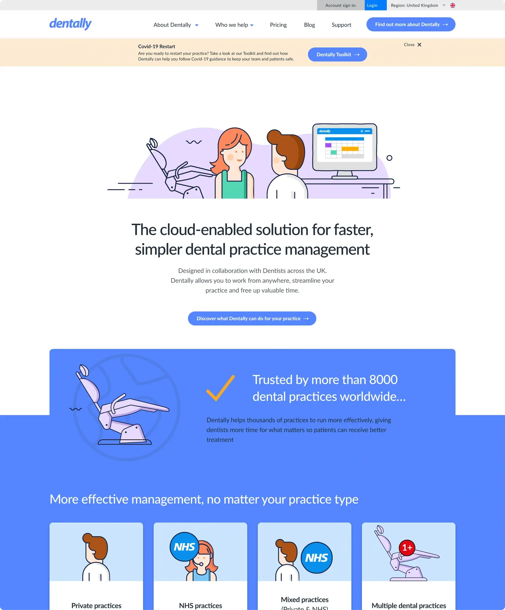
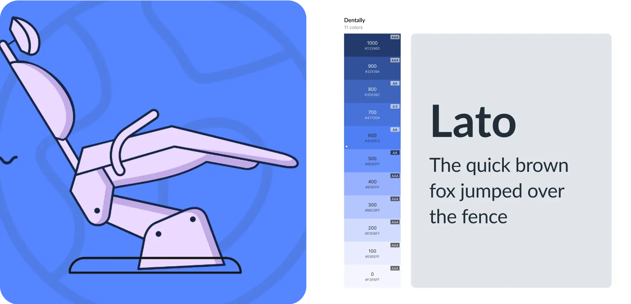
I was tasked with creating concepts, homepage designs, brand style, layout, and functional features for the website homepage. To take the UX and wireframe journeys delivered by Organic and create the high-fidelity final design used for implementation. This involved looking at interactions and implementing the visual language supplied.
The challenge
Dentally previously had a website generating leads, but it faced several issues: The customer journey through the sales funnel was sluggish and inefficient, necessitating extensive intervention from the sales team. The on-site content and structure failed to align with customer needs, resulting in the delivery of irrelevant content at inappropriate times. The website lacked flexibility for swift updates or modifications, resulting in rapid obsolescence.
Solution
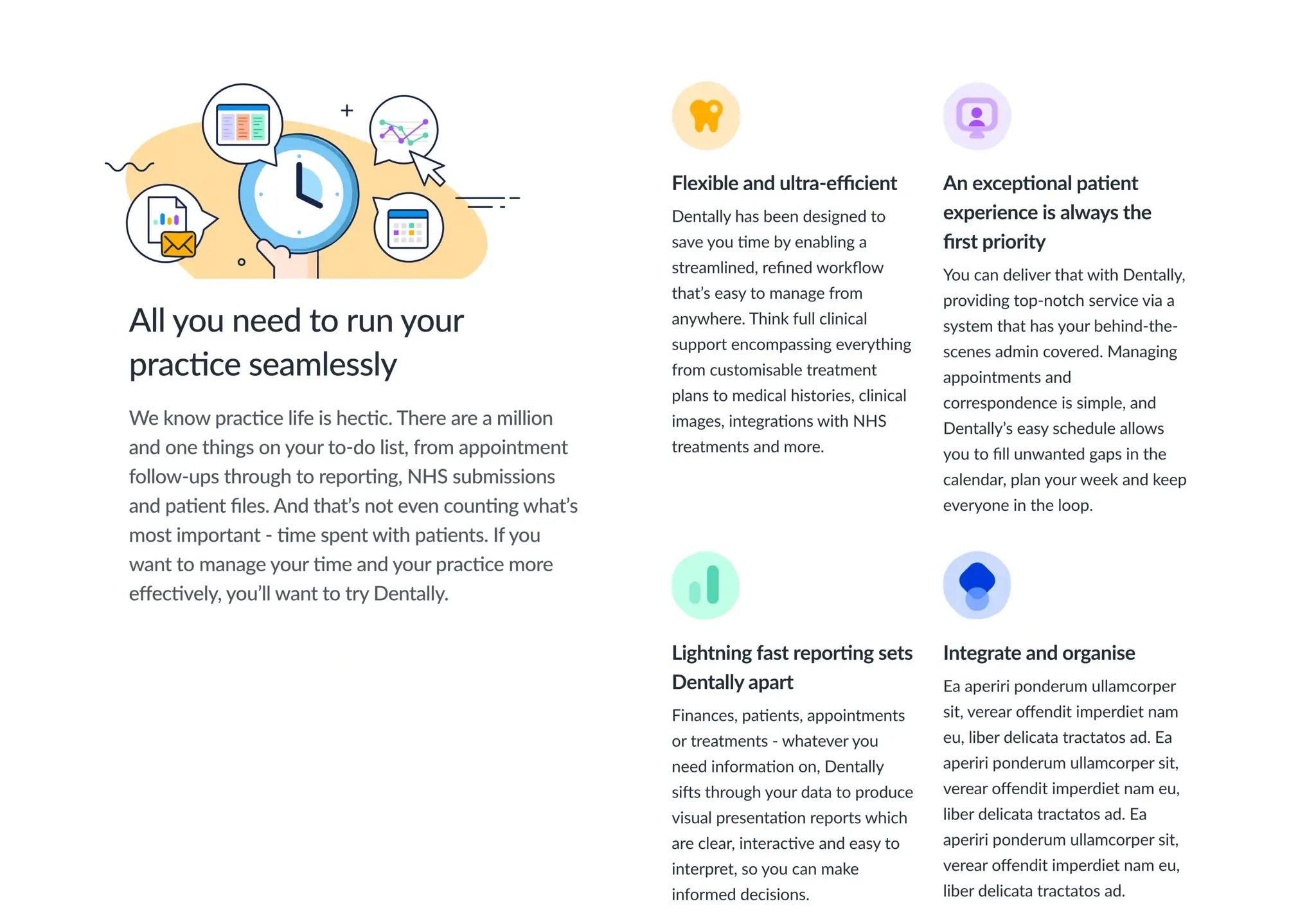
Developed a UI pattern and module library to facilitate the continual creation of pages by the Dentally team in the future.
Revamped the responsive design to impart a more contemporary feel to the digital experience.
Implemented a suite of illustrations across the final designs tailored to guide users through the product and its benefits effectively.
Impact and outcome
According to Organic the project:
Improved customer journeys.
Sales team could focus on nurturing leads and upselling instead of getting stuck in admin tasks.
7% increase in conversion rate in the first 5 months.


