Nathan McCarter Joinery
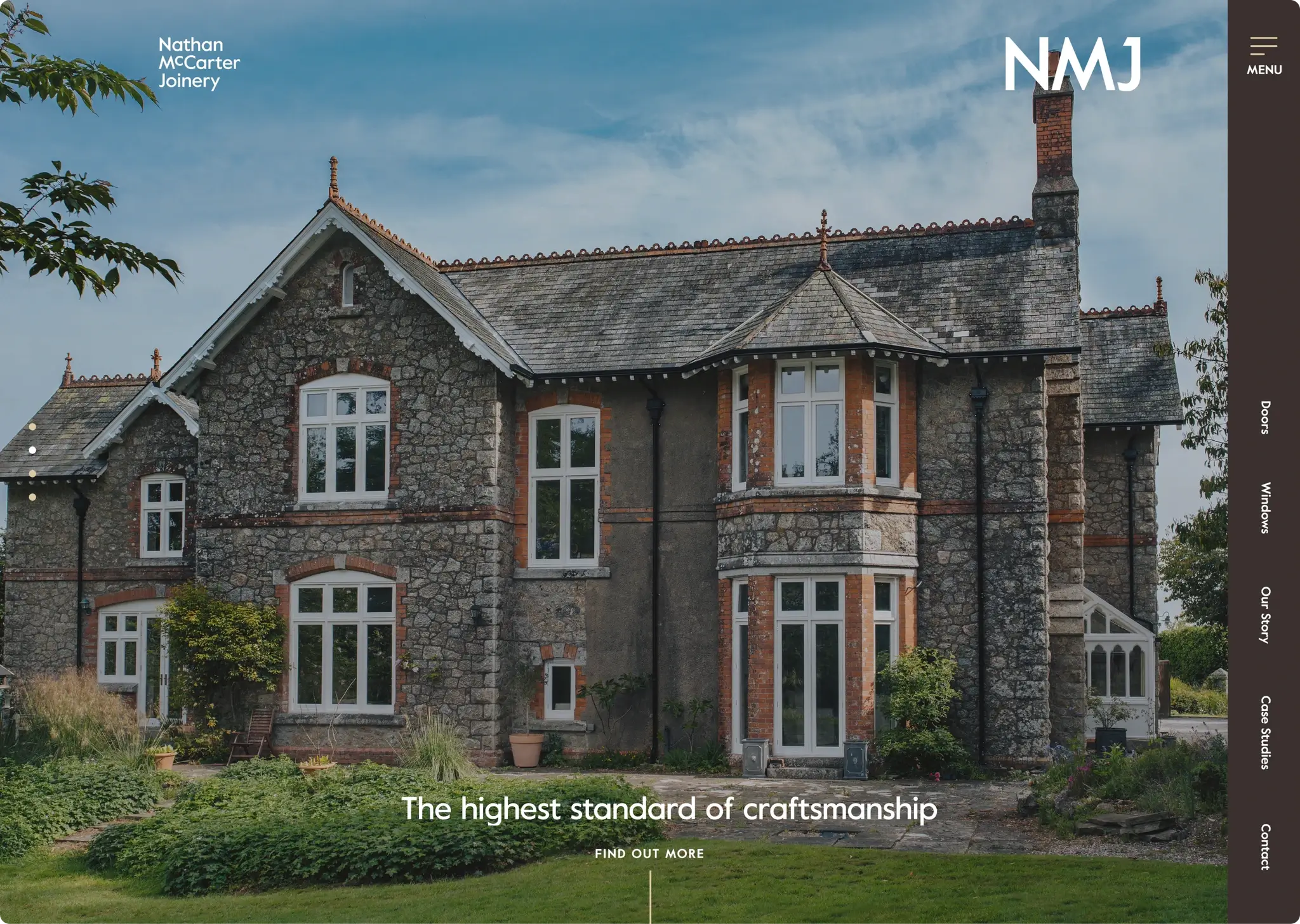
Commissioned by Dave Hallet, we were tasked with reimagining the Nathan McCarter brand and website to reposition the brand as a leader in window and door craftsmanship.
Client
Dave Hallett
Project length
3 months
Deliverables
Brand identity
Signage and assets
Website
Social Assets
Tools
Sketch
Illustrator
Indesign
Slack
Summary
Nathan McCarter aimed to reposition the business focus on windows and doors, as these areas generated the highest revenue and profit. Common pain points for customers seemed to revolve around pricing. My task was to position the brand around quality craftsmanship and the business offer. This was accomplished through a website featuring quality photography and a visual brand.
My role
Conducted audience research to understand the demographics and preferences of the Nathan McCarter business.
Developed the information architecture of the website to ensure intuitive navigation and user experience.
Provided art direction for photography to visually communicate the brand's quality and craftsmanship.
Created wireframes and low-fidelity website screens to outline the layout and functionality.
Designed final website interfaces to be handed over for development.
Conducted developer reviews to ensure the implementation aligned with design specifications.
Explored various logo routes to capture the essence of the brand effectively.
Orchestrated the brand presentation to showcase the desired identity and values.
Produced final brand assets for consistent brand representation across all touch points.
The challenge
The primary challenge stemmed from common customer pain points, which predominantly revolved around pricing concerns.
It was our belief that these price objections were attributable to a misalignment between the brand identity, encompassing elements such as photography and tone of voice, and the genuine characteristics of Nathan's business proposition.
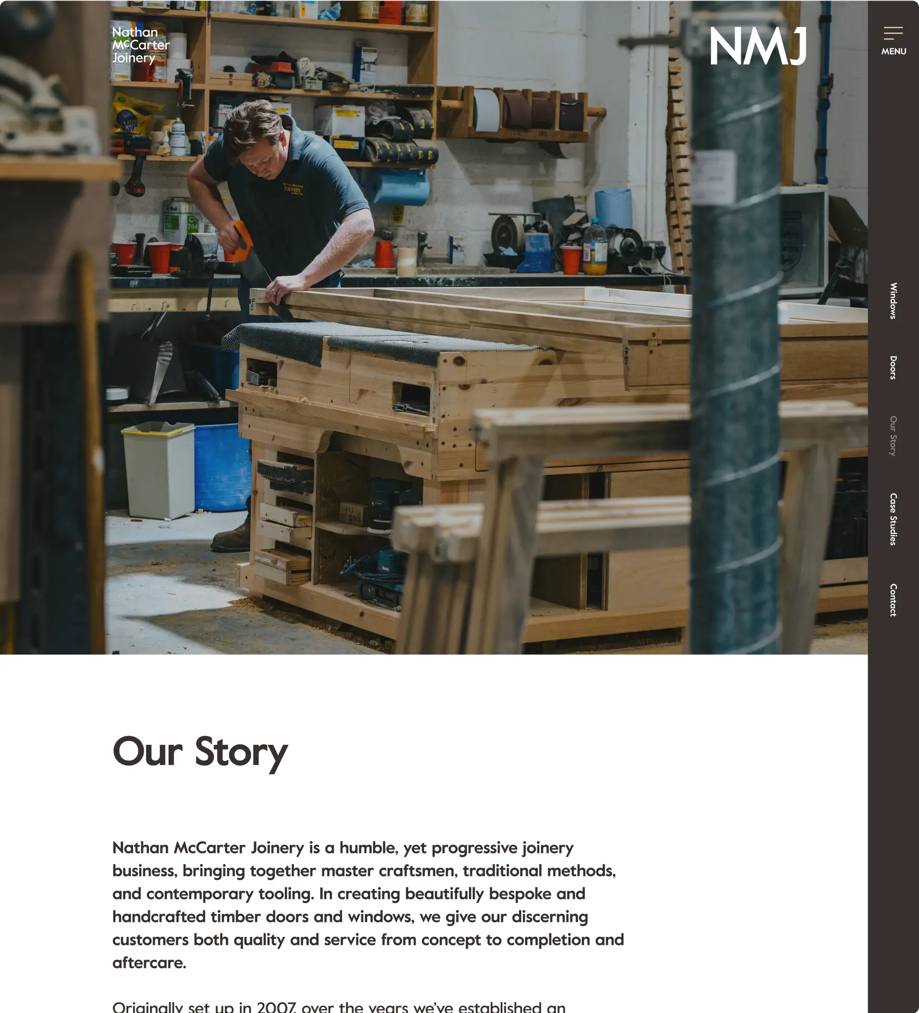
Furthermore, our observation indicated that potential clients often became more receptive to the business after experiencing the workshop firsthand. Visiting the workshop instilled trust in clients and alleviated their anxieties regarding investment risks. Therefore, the challenge was to address these discrepancies in brand perception and effectively convey the true essence of Nathan's business proposition to potential clients.
Solution
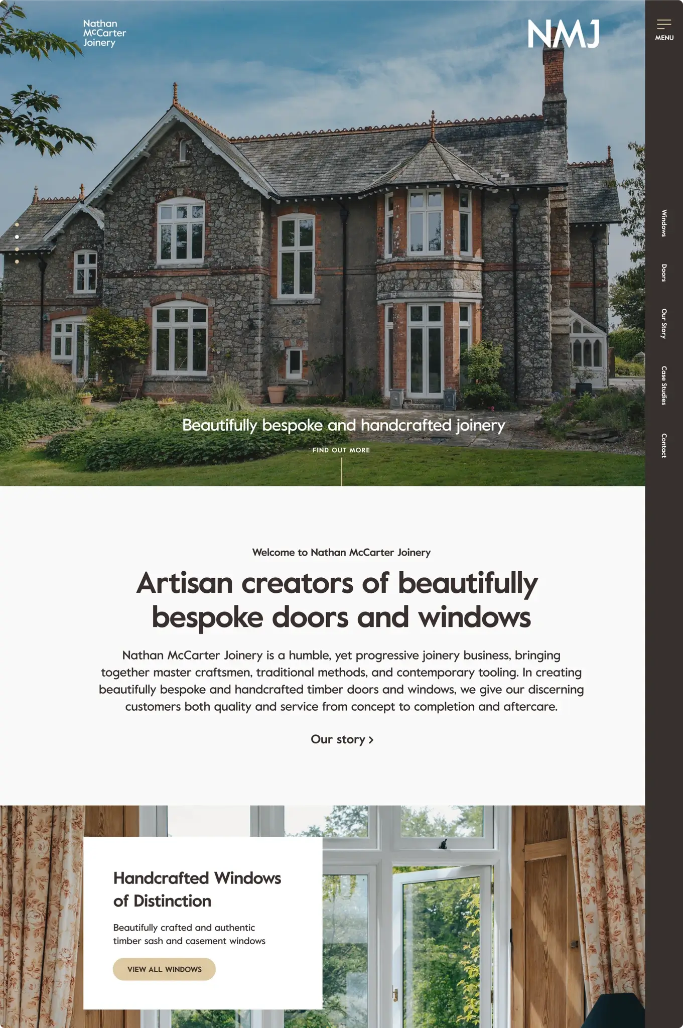
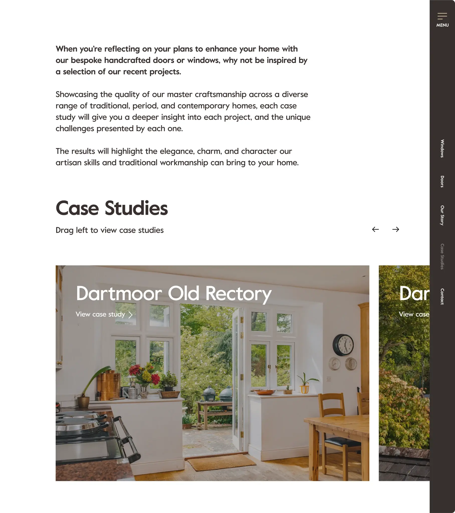
Firstly, we integrated visually rich photography throughout the website to showcase the exceptional quality of the products manufactured by Nathan McCarter. This strategic use of imagery aimed to convey the artisan craftsmanship and highlight the superior value proposition of the brand.
Additionally, the website was designed as a brochure site, strategically crafted to mitigate price concerns by emphasising the unparalleled quality of Nathan McCarter's products. Through compelling visuals and engaging content, we aimed to in-still confidence in potential clients and underscore the brand's commitment to excellence.
Furthermore, we leveraged case studies to provide real-life examples of the business's successful projects and offerings. These case studies served to reinforce the business offer and further validate Nathan McCarter's capabilities and expertise in the industry.
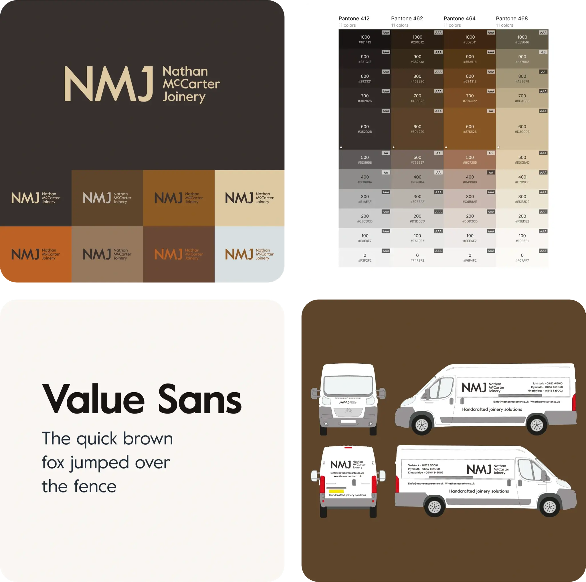
Lastly, the implementation of a new brand identity played a pivotal role in positioning Nathan McCarter as a leader in the field, distinguishing it from 'white van' carpenters and window makers. This refreshed brand identity not only modernised the brand's image but also conveyed a sense of professionalism and trustworthiness to potential clients.
Impact and outcome
Nathan McCarter now boasts a confident brand that has been consistently utilised for over 5 years (from the time of writing this case study), showcasing long-term brand stability and recognition within the industry.
The company has witnessed a continual increase in revenue and the acquisition of new customers, underscoring the efficacy of the brand strategy in attracting and retaining clientele.
The strengthened brand presence and enhanced website functionality have significantly contributed to revenue growth for Nathan McCarter.
Moreover, the brand's emphasis on quality craftsmanship has cultivated trust among customers, establishing Nathan McCarter as a reputable leader in the provision of high-quality doors and windows in the local area.
