WPA Health Insurance
Helping Elixel’s UX team deliver: quote, buy, transfers, renewals, application and full medical underwriting experiences during a 6 month project phase.
Client
Elixel
Project length
6-7 Months
Deliverables
Wireframes for Web/Mobile
End-to-end prototypes
Design System
High fidelity designs
Tools
Miro
Slack for Comms
Adobe XD
Summary
Collaborating with Elixel's UXD team and the Head of User Experience Design, we endeavoured to enhance the online experiences of WPA Health Insurance offerings for both corporate entities and private individuals.
Our challenge encompassed several objectives, including enhancing the product selection process, creating a seamless full medical underwriting experience, refining the public-facing quote and purchase journey, developing a dashboard tailored for healthcare providers, and implementing a scalable design system.
My role
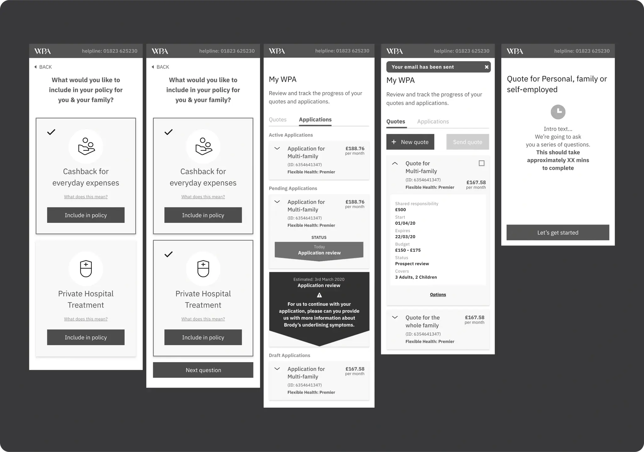
Collaborating closely with the Head of UX, my responsibilities included translating Quote and Buy wireframes into mobile-friendly experiences. This entailed identifying and addressing navigational and responsive considerations.
I delved into understanding WPA's transfer and renewal processes for customers, translating these insights into wireframes and crafting user journeys and prototypes that effectively communicated our solutions.
I took charge of creating end-to-end prototypes for mobile breakpoints, covering areas such as quote and buy, transfer and renewals, as well as applications, among others.
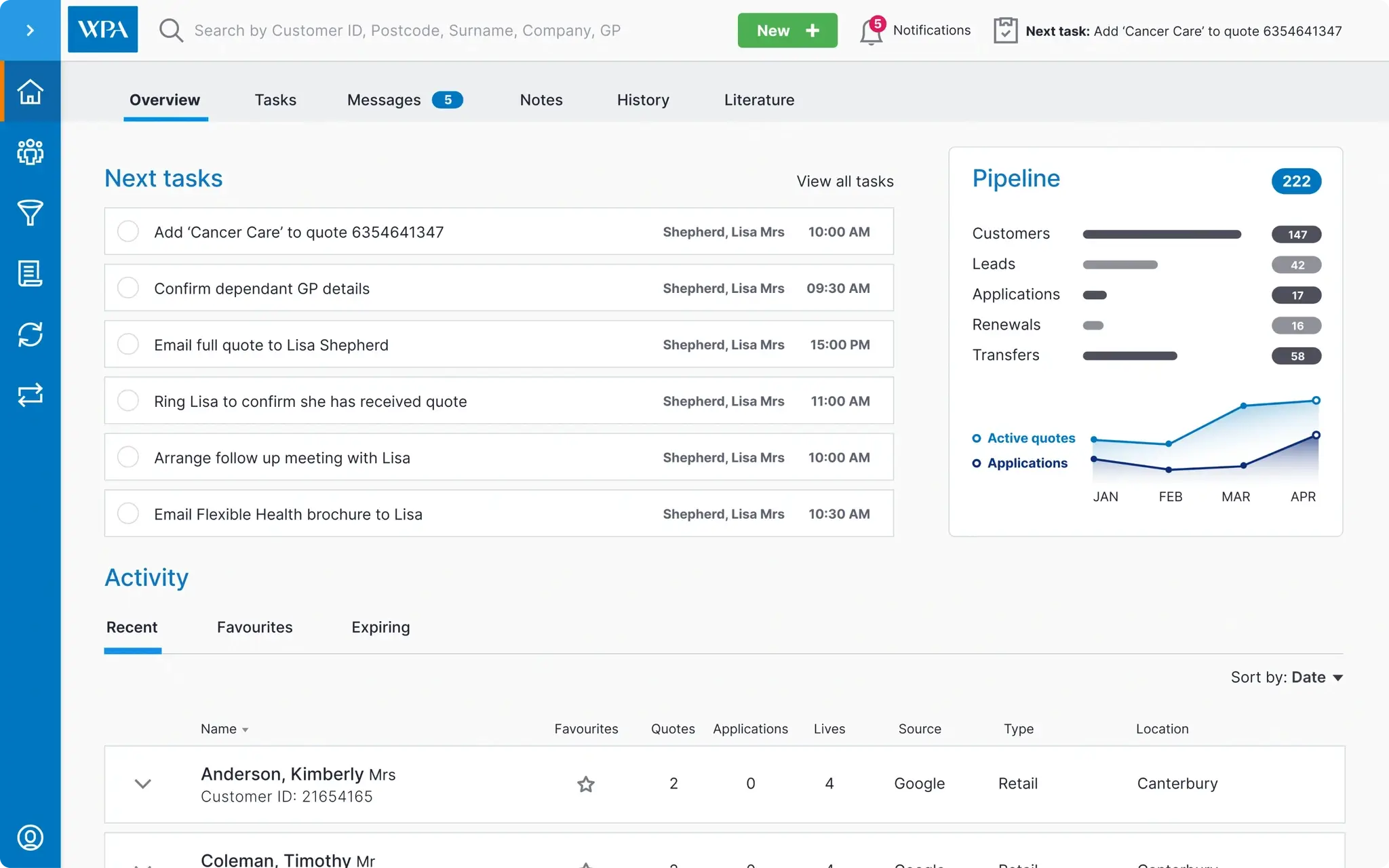
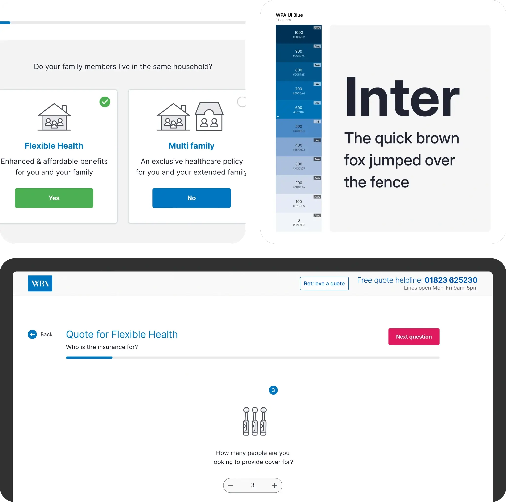
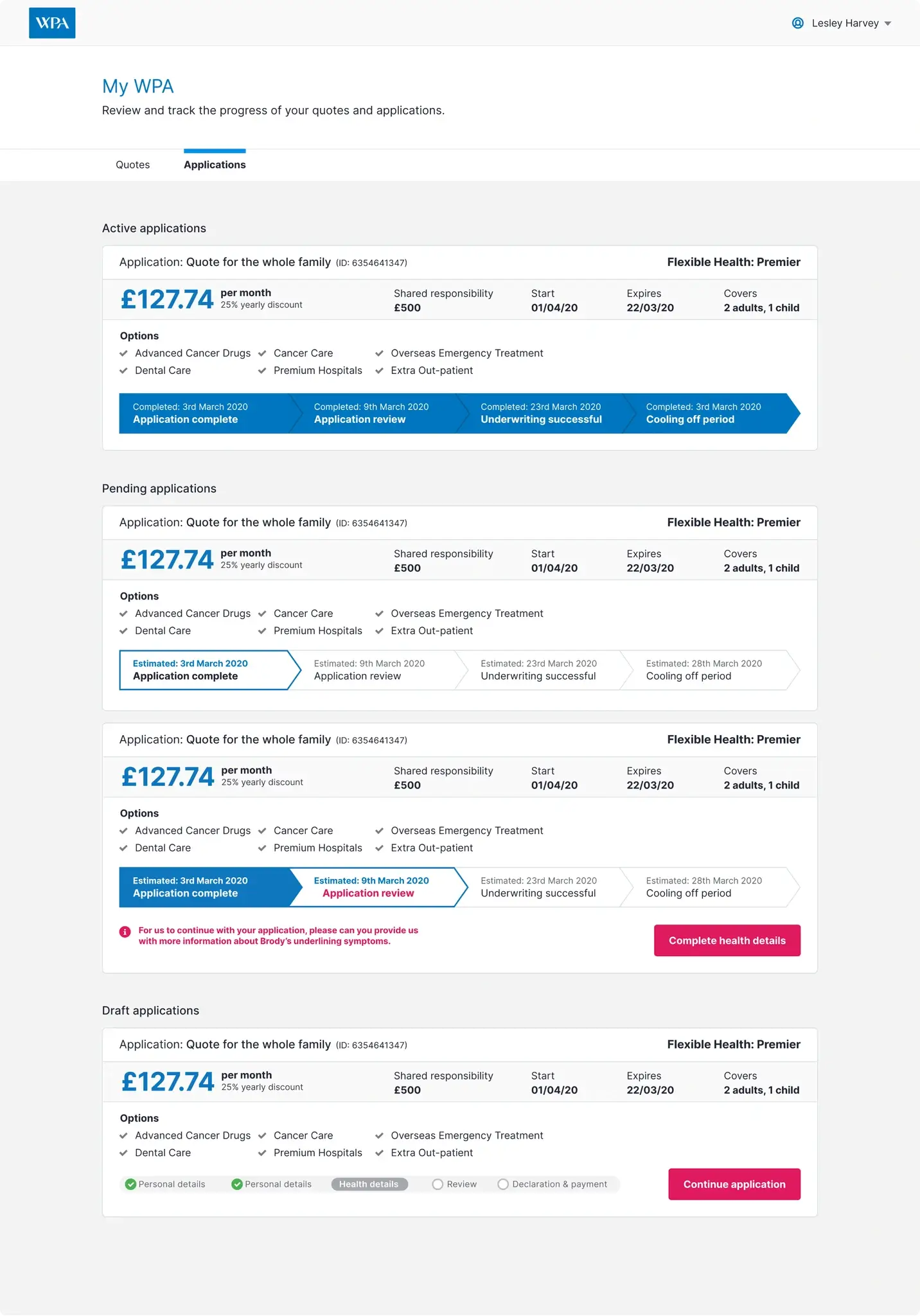
In addition, I led the development of high-fidelity designs for web and dashboard concepts. To maintain consistency across the project, I established a design system component library, enabling other designers on the team to reuse components effectively.
To ensure the experiences resonated with user needs, I maintained regular communication with the client, incorporating feedback from user testing and reviews. Throughout the project, I collaborated closely with the Head of UX to ensure alignment with project goals and objectives.
The challenge
One of the primary challenges revolved around consolidating all business requirements and WPA's product offerings tailored to its main user demographics: 1. Individuals and families, and 2. Enterprise business users. WPA's application process relied heavily on outdated paper-based systems.
However, the most significant hurdle was simplifying complex healthcare packages to make them easily understandable for users, enabling them to select the most suitable option that aligns with their individual or group requirements.
Solution
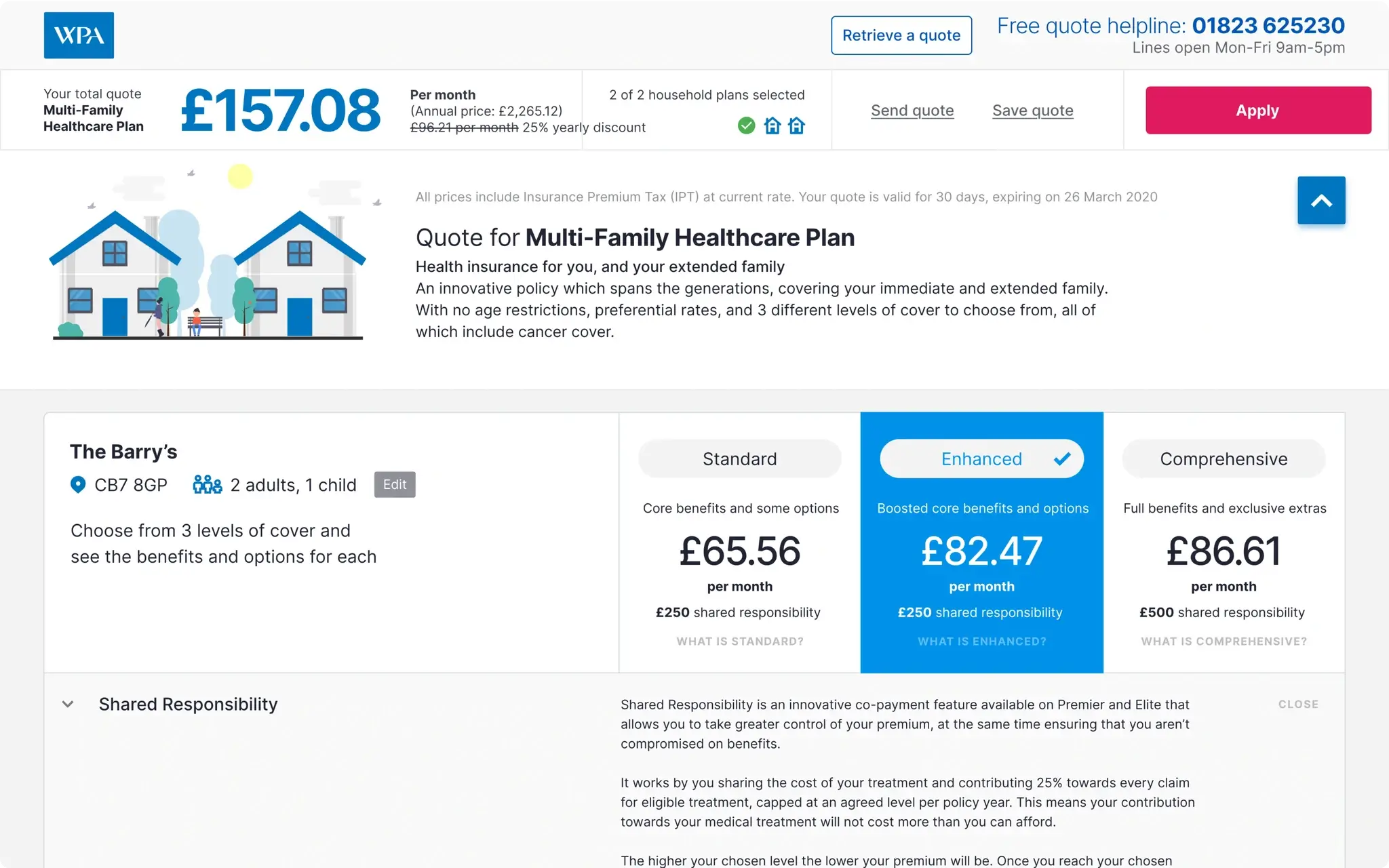
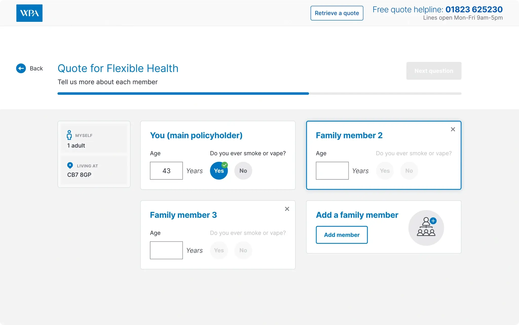
Under the leadership of the Head of UX, a Quote and Buy product selector was developed to alleviate the ambiguity surrounding the identification of the correct healthcare package for users. This innovative approach utilised a series of qualifying questions to guide customers towards the most suitable package for their specific needs.
Subsequently, users could obtain a quote and proceed with the insurance application process. Numerous prototypes were iterated upon to refine this selection process, with regular presentations to the client to ensure alignment with compliance and legal requirements. Feedback gathered during these sessions informed iterative improvements to the design.
While our team concurrently worked on various user experiences, we maintained close collaboration to uphold consistency across all deliverables. Over the course of the project, we produced more than six Adobe XD design files containing wireframes and fully prototyped journeys. Adopting an agile approach, development teams began implementing designs following each round of user testing. I personally oversaw the delivery of all high-fidelity screens for the Quote and Buy experience, as well as the HP Dashboard designs, and played a pivotal role in establishing a comprehensive design system.
Additionally, I contributed to the UX of the project by focusing on transfer and renewals, providing wireframes and crafting user journeys to enhance these specific aspects of the user experience.
Impact and outcome
Following months of dedicated effort, involving numerous iterations and adaptation to changing requirements, we successfully delivered an enhanced experience for individuals seeking health insurance with WPA.
The Quote and Buy experience was integrated into the WPA homepage, providing users with a streamlined and intuitive pathway to explore and purchase insurance packages. Moreover, the design system I spearheaded laid the groundwork for future projects, including the development of the WPA mobile app.
Although my contract concluded before measurable outcomes could be observed for aspects such as the HP Dashboard, transfers, and renewals, our collaborative efforts resulted in significant progress.
Despite encountering challenges along the way, these obstacles provided valuable insights that ultimately contributed to refining our work and delivering a successful outcome for both WPA and their customers in need of health insurance.
